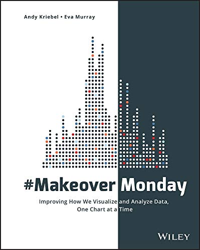
#MakeoverMonday
Improving How We Visualize and Analyze Data, One Chart at a Time
Andy Kriebel; Eva Murray
BOOK REVIEW

In a world bombarded by an avalanche of data, how do we cut through the noise and find clarity? #MakeoverMonday: Improving How We Visualize and Analyze Data, One Chart at a Time emerges as an essential beacon for anyone yearning to enhance their data visualization skills. This isn't just a book; it's a manifesto that illuminates the path to transforming the mundane into the magnificent.
At its core, this book, authored by the dynamic duo Andy Kriebel and Eva Murray, combines passion with purpose. They offer an exhilarating experience through a treasure trove of practical insights and eye-opening examples, compelling you to re-evaluate how you're currently digesting and presenting information. The authors tap into the exhilarating world of data, drawing from their rich expertise to provide you with a toolkit designed not just to improve your charts but to revolutionize your approach to data entirely.
What makes this work stand out isn't just its stunning visual designs, but the philosophy underpinning them. As you immerse yourself in its pages, you begin to feel the authors' urgency-their mission to rid the world of uninspired, unengaging data presentations. Every chart is transformed from a lifeless statistic into a vibrant story waiting to unfold. They encourage you to think critically, to not just scrutinize the data, but to rip it apart and rebuild it in a way that resonates with viewers on a profound level.
Consider, for a moment, the landscape of data visualization before this shake-up. It was drowned in drab Excel spreadsheets and bar graphs that sent shivers down the spine with every glance. But with Kriebel and Murray leading the charge, you will emerge from the haze equipped with the skills to produce visuals that captivate, inform, and inspire. The experience is akin to suddenly discovering that you possess the powers of a sorcerer, wielding the ability to conjure clarity from chaos.
The authors also bring the conversation to the socio-cultural shifts in how information is consumed today. We live in an age where attention spans are fleeting, and the ability to grasp and retain information is increasingly imperative. Vivid charts and compelling visuals aren't just nice to have; they are critical to effective communication. In an exhilarating twist, they build a case that illustrates how impactful visual storytelling can lead to more informed decision-making-and isn't that a goal worth striving for?
Critics have taken to the pages of this groundbreaking book, with some noting its practicality as a significant boon. Yet, skeptics argue that it leans heavily into aesthetics at the cost of rigorous data analysis. A valid point, but if you're looking to grab your audience's attention and keep it, the authors challenge you: why not both? This book captures a beautiful balance, reminding you that good data should never be cloaked in mediocrity.
Fans of the book rave about its hands-on approach, relishing in the transformative practices and community-driven ethos that characters the #MakeoverMonday movement. The tight-knit community of data enthusiasts and the shared commitment to improving skills are palpable, drawing you into a world bursting with camaraderie and the thrill of discovery. In a playful manner, Kriebel and Murray speak directly to you, fostering a sense of shared journey, which enhances your eagerness to pick up a similar brush and unleash your creativity on the canvas of data.
Engaging with #MakeoverMonday is not merely an intellectual exercise; it catalyzes a shift in the way you perceive your data landscape. As you read, you may find yourself compelled to revisit your old presentations, shaking your head and perhaps chuckling at how easily you accepted mediocrity. Wouldn't it be a tragedy to let your hard-earned data fade into obscurity? With each compelling example and every actionable tip, this book demands that you elevate your visualization game and embrace your inner data artist.
In this modern age, where storytelling is paramount, this book is the beacon you didn't know you needed. As you turn the pages, each crafted word and carefully constructed chart pulls you deeper into a world where everyone can become a master at making data sing. You find yourself teetering on the edge of eureka moments, eager not just to read more, but to act, create, innovate.
Dive into #MakeoverMonday, and discover how you can wield the transformative power of data visualization. 🌟 It's time to say goodbye to boring charts and hello to a vibrant narrative that changes the way we connect with information. Don't let this book slip through your fingers; it's more than just a read-it's a revolution waiting to unfold!
📖 #MakeoverMonday: Improving How We Visualize and Analyze Data, One Chart at a Time
✍ by Andy Kriebel; Eva Murray
🧾 496 pages
2018
#makeovermonday #improving #visualize #analyze #data #chart #time #andy #kriebel #AndyKriebel #murray #EvaMurray